Building a Lightning Payment Gateway from Foundation to MVP
Designed Speed, a Lightning Network payment gateway from the ground up, taking it from research and branding to a functional MVP with onboarding, payment links, checkout links, and essential settings.
Overview
Speed is a SaaS based Lightning Network payment gateway that enables businesses to accept Bitcoin payments. The product was initiated by the founders at OpenXcell Technolabs, who had a long term vision of building a fintech product.
At that time, I was working as a Product Designer on GoodFirms at OpenXcell. While working on that product, the founders shared their vision for Speed and invited me to join the project as a part time Product Designer. I was responsible for designing the product from the ground up, helping turn an early idea into a working product.
As the Product Designer during the early stage of the product, I worked closely with the founders to shape the initial user experience. My responsibilities included competitor research, user flows, information architecture, wireframing, high fidelity UI design, prototyping, creating the design system, and collaborating with engineers during implementation.
Speed was an early stage fintech product with no existing product structure or user experience. The challenge was to turn the founders’ vision into a simple and trustworthy payment experience while making Bitcoin payments easy for businesses to understand and use.
I shaped the product from the ground up, starting with research and competitor analysis and translating the findings into clear user flows and a scalable product structure. The MVP focused on a simple onboarding experience, payment links, checkout links, and essential settings.
Market Research
Since cryptocurrency payments were a new domain for me, my first step was to understand how the industry worked before starting the design process. I worked closely with the founders to learn about the Lightning Network, Bitcoin payments, merchant workflows, and the overall product vision.
Alongside these discussions, I studied existing crypto payment platforms to understand how businesses accepted and managed digital payments. This research helped me identify common user flows, understand industry patterns, and recognize opportunities to make the experience simpler for business users who were new to cryptocurrency.
User Persona
Based on the market research and competitor analysis, I created a user persona for an E-commerce Business Owner to better understand their needs, goals, and challenges when accepting Bitcoin payments. This persona helped define key user expectations and guided design decisions throughout the product, keeping the experience focused on solving real business problems.
Emmanuel Mensah - E-Commerce Business Owner

Emmanuel Mensah
E-Commerce Business Owner
Goals
- Accept Bitcoin payments on his online store.
- Receive payments quickly and securely.
- Manage all crypto transactions in one dashboard.
- Give customers more payment options.
Pain Points
- Most crypto payment platforms feel complex.
- Wallet and gateway setup feels confusing.
- Technical terms make onboarding harder.
- Payment and settlement tracking is difficult.
“I want to accept Bitcoin payments without dealing with the technical side of crypto."
User Story
As an e-commerce business owner, I want to accept Bitcoin payments through a simple and secure payment gateway so I can offer my customers more payment options without dealing with the complexity of cryptocurrency.
Key Research Insights
Simplify the Complexity
Crypto payment platforms often expose technical concepts, making them difficult for businesses new to cryptocurrency.
Make Payments Easy to Manage
Businesses need a simple way to create payment requests and manage transactions without navigating complex workflows.
Build Trust Through Clarity
Clear payment details, transaction status, and settlement information can make crypto payments easier to understand and manage.
Benchmarking
I benchmarked existing cryptocurrency payment platforms to understand how they approached key experiences such as onboarding, payment creation, checkout, and transaction management. This helped identify common patterns, gaps, and opportunities to create a simpler experience for businesses new to cryptocurrency.
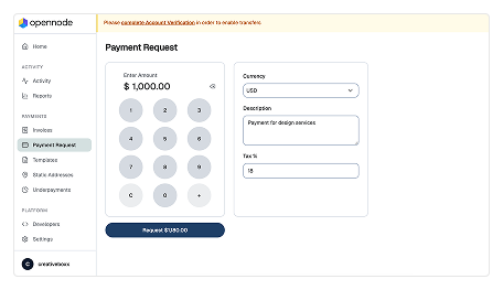
OpenNode
Reviewed the checkout experience, payment flow, and merchant dashboard.
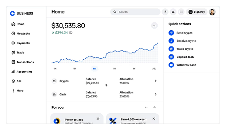
Coinbase Commerce
Studied its merchant dashboard and transaction management experience.
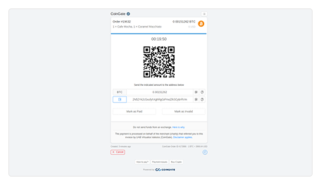
CoinGate
Studied its checkout experience and payment flow for a smoother customer journey.
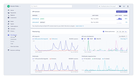
Stripe
Studied familiar payment patterns and usability principles that could be adapted for crypto payments.
Product Goal
The research and benchmarking helped define a clear direction for Speed. The goal was to create a simple and accessible payment experience that removed unnecessary complexity from cryptocurrency payments. The product needed to make it easy for businesses to get started, create and share payment links, manage transactions, and accept Bitcoin without requiring deep technical knowledge.
User Goals
- • Set up the account without technical complexity.
- • Accept Bitcoin payments easily.
- • Create and share payment links quickly.
- • Track payments and transaction status.
- • Manage payments from one place.
Business Goals
- • Make Bitcoin payments accessible to more businesses.
- • Reduce complexity in crypto payment setup.
- • Provide a reliable payment processing experience.
- • Build a scalable foundation for future payment features.
- • Create a simple and trustworthy fintech product.
Information Architecture
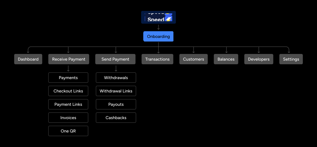
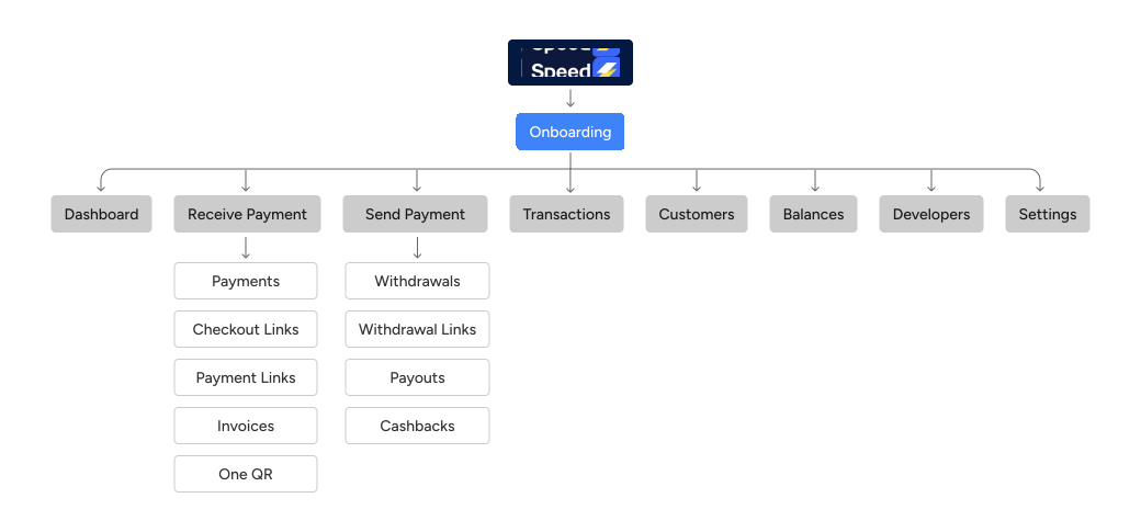
With the product goals defined, the next step was to structure the MVP around the core tasks businesses needed to complete. I mapped the key features and grouped them into a simple navigation structure, making it easy to move between onboarding, payments, payment links, checkout, transactions, and settings. This structure became the foundation for the user flows and screen designs that followed.
Lo-fi Wireframes
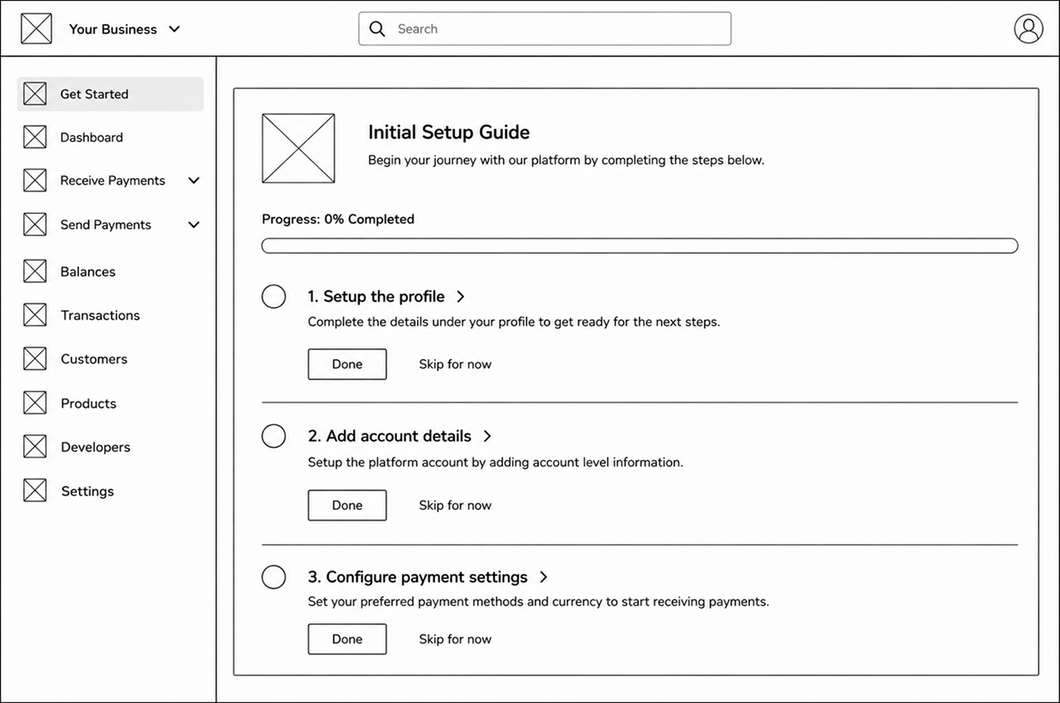
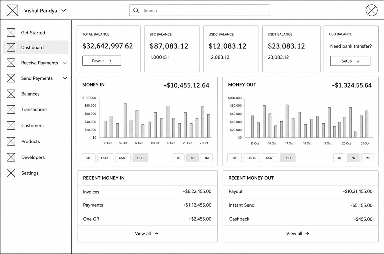
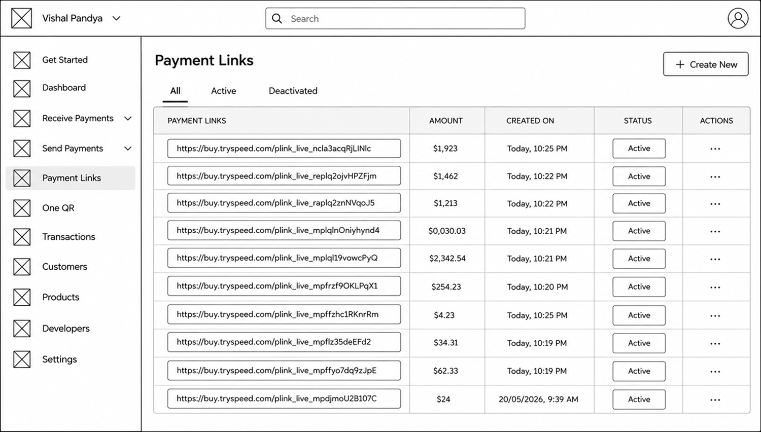
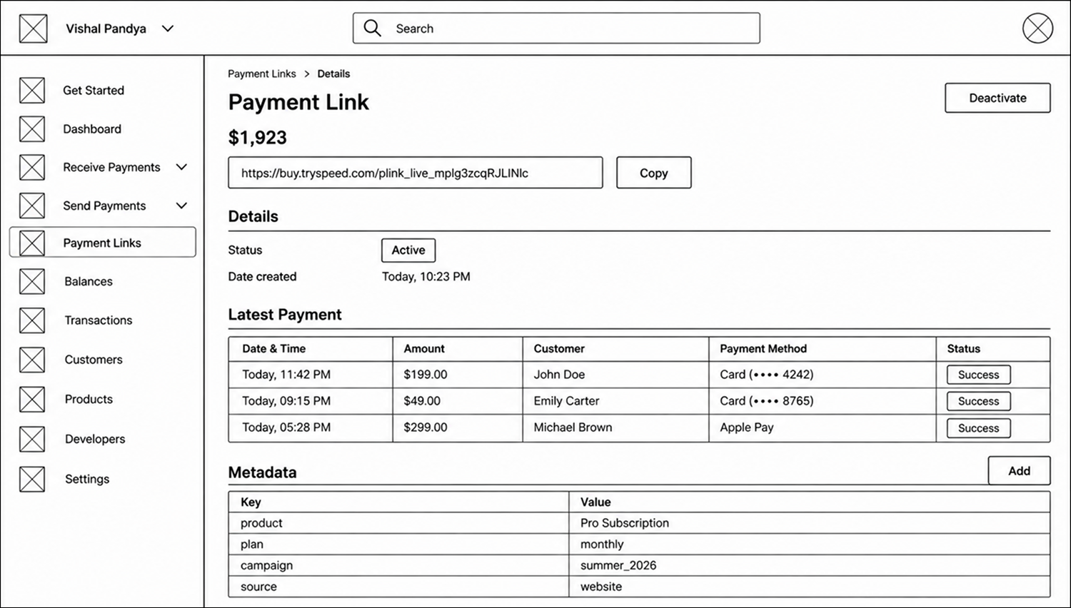
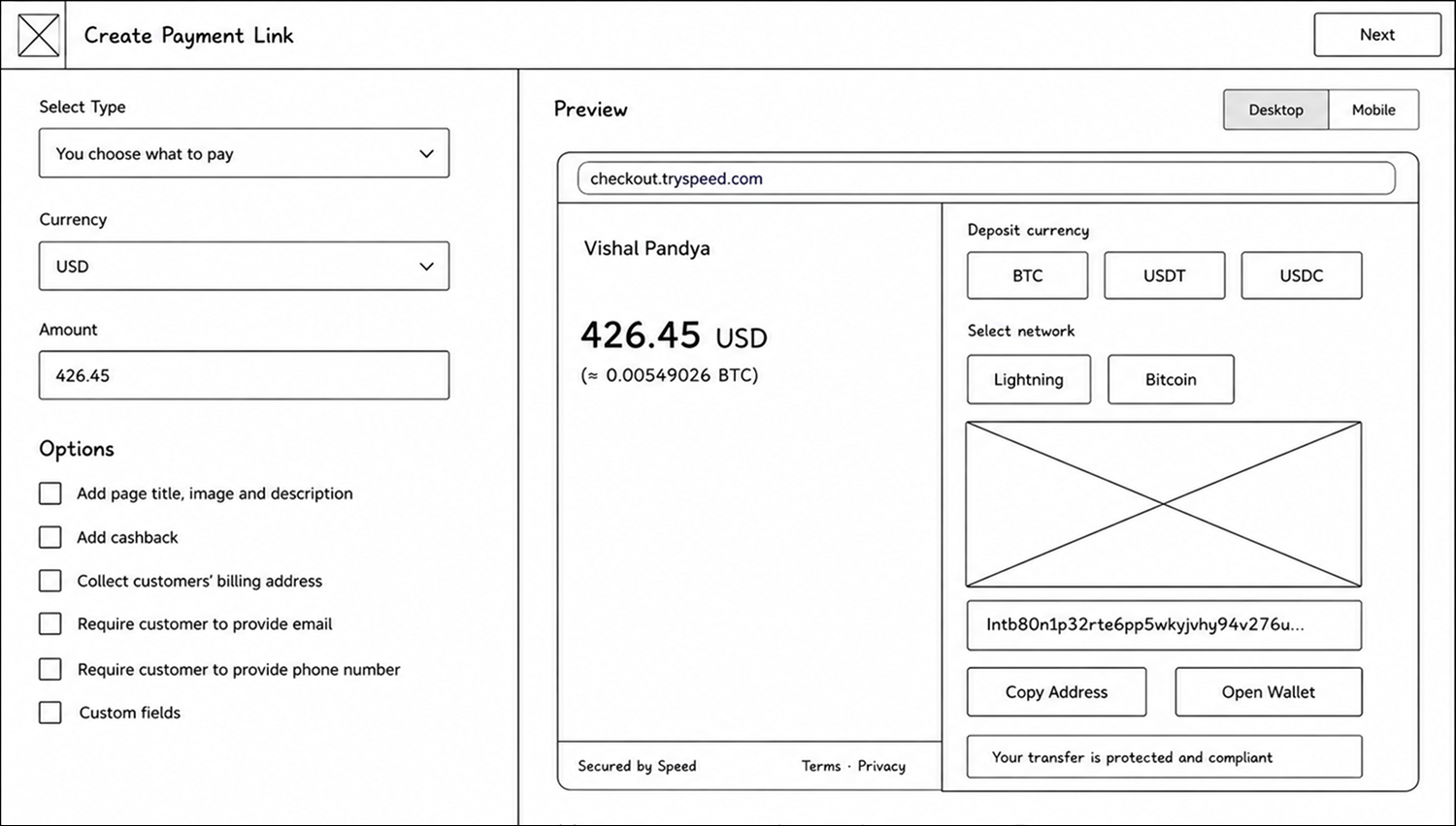
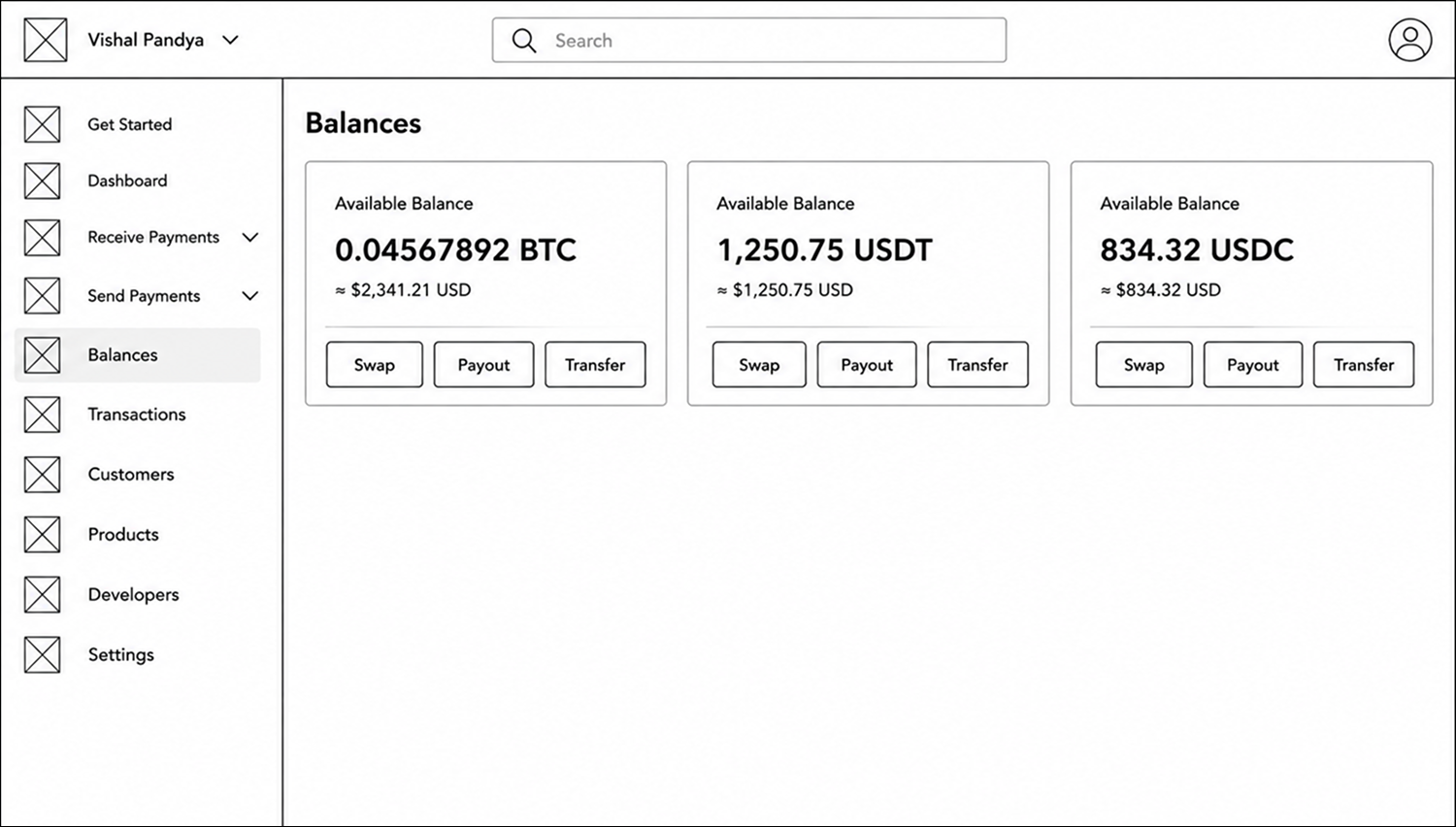
With the information architecture in place, I moved into low fidelity wireframes to define the core layouts and interactions. The focus was on validating the structure and flow of the MVP before moving into visual design, with key workflows such as onboarding, payment links, checkout, and transaction management taking shape.
Branding & Identity
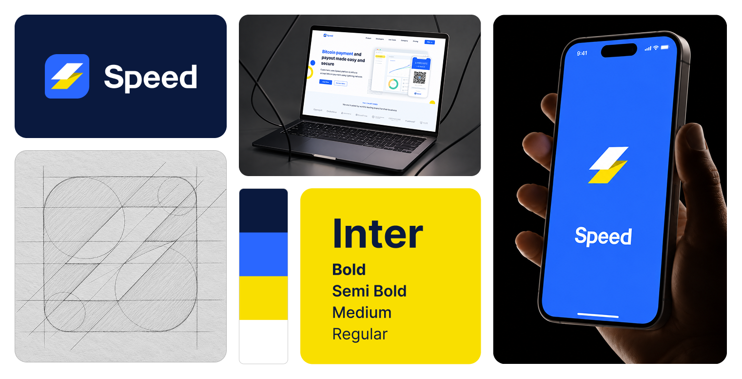
Alongside the product design, I developed Speed’s visual identity from the ground up. This included designing the logo and creating the overall branding guidelines covering typography, colors, visual elements, and usage principles. The goal was to establish a consistent and recognizable identity that could be carried across the product, website, and other brand touchpoints.
Scalable Design System
As Speed evolved from an early concept into a working MVP, maintaining consistency across different screens and workflows became important. I created a scalable design system with reusable components, typography, spacing, colors, and interaction patterns to keep the experience consistent and make it easier to design and expand new features.
Color System
Consistent color tokens for scalable design and clear visual hierarchy.
Typography
A flexible type system with predefined styles for clear, readable interfaces.
Spacing and Radius
Consistent spacing, sizing, and corners using design tokens.
Icons
A huge icon set designed to stay clear, meaningful and visually aligned.
Shadow and Blurs
Depth and elevation styles that add clarity, focus, and visual rhythm.
Components
Reusable components and controls for consistent, seamless interfaces.
Final Designs
After defining the product structure, validating the core flows through wireframes, and establishing the visual identity, I moved into the final design stage. The focus was on turning the core MVP workflows into a clear and consistent experience across onboarding, payment links, checkout, and the supporting product features.
User Onboarding
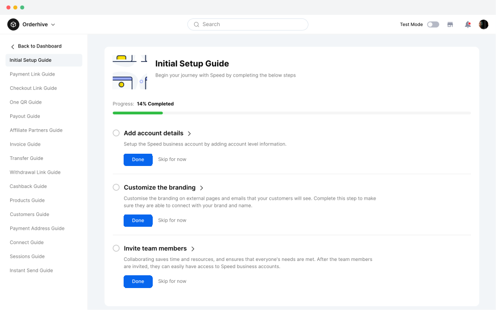
The onboarding experience was designed to help new users set up their account and understand the key steps required before accepting payments. The flow breaks the setup into clear, manageable steps, allowing users to complete essential details at their own pace while keeping their progress visible throughout the process.
Dashboard
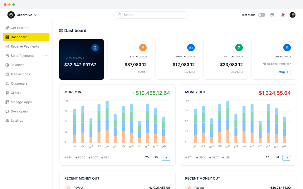
With the core setup in place, the next step was to give users a clear view of their payment activity and balances. The dashboard brings key financial information, money in and out, and recent transactions into one place, helping merchants quickly understand their payment activity and manage their account.
Payment Links
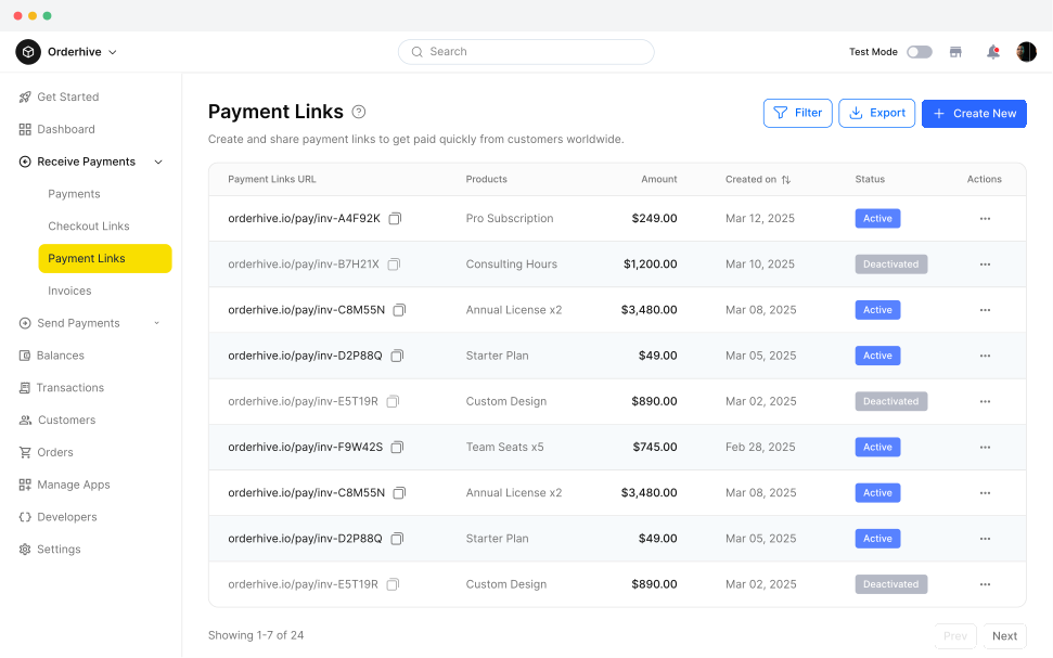
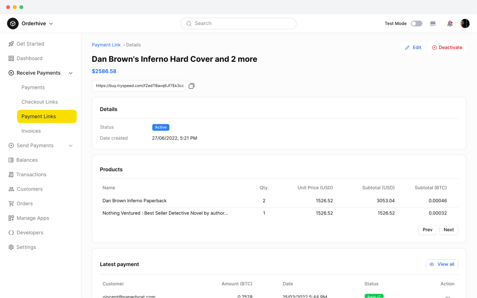
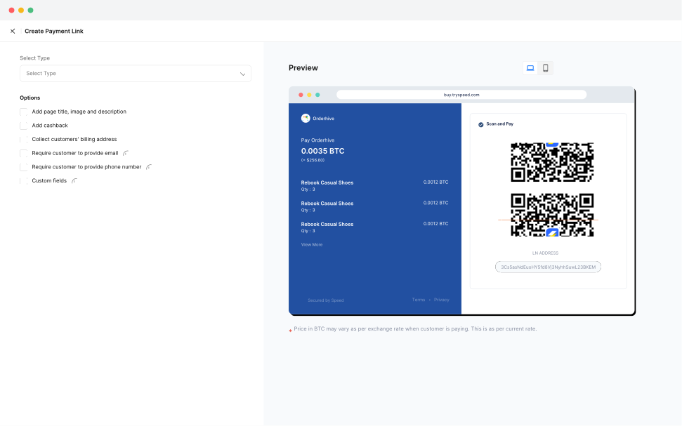
To make accepting Bitcoin payments easier, the payment link experience was designed as a simple end to end workflow. Businesses can view and manage their existing payment links, open detailed information about each link, and create new links by entering the required payment details. The flow keeps link creation and payment management straightforward, giving merchants a single place to manage their payment requests.
Balances
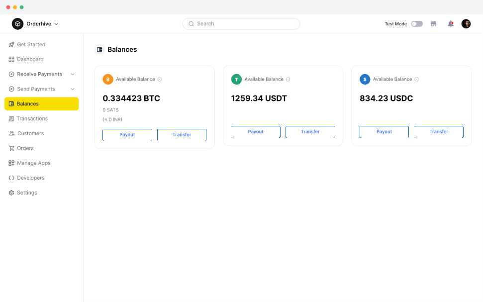
As businesses started receiving payments, they needed a clear way to understand and manage their available funds. The Balances experience brings supported currencies and their available amounts together in one place, with actions such as swapping, payouts, and transfers to help merchants manage their funds easily.
Usability Test
After the beta launch, we tested the product with live users and gathered feedback on the key workflows. The feedback helped us identify usability issues, unclear interactions, and areas where users needed a simpler experience. We then used these insights to iterate on the designs, refining the workflows and interactions to make the product clearer, more intuitive, and easier to use.
Iterating From User Feedback
Simplifying Payment Link Creation
Refined the payment link flow to make the creation process more straightforward and reduce unnecessary steps.
Improving Onboarding Clarity
Adjusted the onboarding flow to make each setup step easier to understand and complete.
Making Payment Status Clearer
Improved payment and transaction states so users could quickly understand the status of each payment.
Key Insights
Payment Link Task Success
Most users were able to create a payment link successfully during usability testing, validating the clarity of the core payment workflow.
Ease of Use
Users rated the overall experience highly, indicating that the simplified workflows made the product easier to understand and use.
Onboarding Completion
Users were able to complete the onboarding flow successfully, showing that the setup experience was clear enough for first time users.
Learning
Designing Speed from concept to MVP taught me that fintech products need to balance simplicity with trust. The experience should make complex payment concepts easier to understand while giving users confidence at every step.
Simplify Complex Products
Cryptocurrency can feel technical and unfamiliar. Breaking complex concepts into simple workflows helped make the product more approachable for businesses.
Design for Trust
Payment products need clarity at every step. Clear information, predictable interactions, and transparent payment states help users feel more confident when managing their money.
Design With Real Feedback
The beta launch showed that even well planned workflows can be improved through real usage. User feedback helped us identify friction and refine the experience based on how people actually used the product.
Other Case Studies
Designing a SaaS Spend Management Platform from the Ground Up
Designed a B2B SaaS platform helping small businesses understand and optimise their SaaS software spend, with workflows for accountants and bookkeepers.
Designing Booz Mobility: Simplifying Electric Scooter Rentals
Designed an Android app that simplifies electric scooter rentals, allowing users to find nearby scooters, unlock them, track rides, and complete rentals through a simple mobile experience.